

Project Overview
The Product
Budget Buddy is a money management app for young adults and students. It helps users track spending, set budgets, and save money. The app is simple to use and made for people who want better control over their finances.
My Role
UX Designer and Researcher
My Responsibilities
-
User research (selecting pain points from the provided materials)
-
Setting personas (including problem statements)
-
Creating user journey maps
-
Creating wireframes, mockups, and prototypes
-
Conducting usability studies
The Goal
To design a simple and intuitive budgeting app that helps users track their income and expenses easily. The app aims to improve users’ financial habits through clear visuals and personalized insights.
The Problem
Users found it difficult to track their spending habits and often felt overwhelmed managing budgets manually. They needed a simple and clear way to monitor expenses and stay on top of their financial goals.
User Research: Summary
For my user research, I conducted a mix of qualitative interviews and demographic analysis to understand the financial habits, challenges, and needs of potential users. Initially, I assumed that most users looking for a budgeting app would be young professionals trying to manage their personal finances. However, after analyzing the data, I found that budgeting concerns extend across different age groups and lifestyles, including busy parents, small business owners, and individuals balancing multiple financial responsibilities. This insight shifted my focus toward creating a more flexible and intuitive solution that caters to a broader audience with varying financial goals and challenges.
User Research: Pain Points
Lack of Financial Literacy
Many users struggle with understanding effective budgeting and saving strategies. This highlights the need for a user-friendly interface with educational resources, such as step-by-step guides, interactive tutorials, and financial tips integrated within the app.
Difficulty Tracking Expenses
Users often find it challenging to manually track their income and expenses, leading to disorganized finances.
To address this, the app should feature automated expense tracking, easy data input, and visual summaries to provide a clear financial overview.
Complex Budgeting Tools
Existing budgeting apps are too complicated, discouraging users from managing their finances. The design should prioritize simplicity, with customizable budgeting templates, intuitive navigation, and a seamless onboarding experience to ensure accessibility for all users.
Lack of Motivation
Users struggle to stay consistent with budgeting due to a lack of accountability. Gamification elements, such as progress tracking, financial goal-setting, and reminders, will help maintain motivation and encourage financial discipline.
Problem Statement
Neelam, a dedicated teacher and mother, struggles to balance her professional and personal responsibilities while managing household finances. She needs an easy way to track expenses and set monthly budgets to ensure financial stability without adding to her daily stress.
Round 1 Findings
-
Users found the AI budget setup quick and easy to complete.
-
Most users struggled to locate the financial insights section.
-
Participants wanted more control over customizing budget categories.
Round 2 Findings
-
Users successfully located the financial insights tab.
-
Participants appreciated the flexibility in customizing budget categories.
-
Some users found the progress tracking visuals unclear.
Persona: Neelam Sharma

Mapping out the flow of Neelam’s user journey revealed the benefits of creating an app for users without much finance literacy to plan, budget, spend and save their money efficiently.
User Journey Map

I took the time to draft each possible home screen of the app on paper which in turn ensured that the elements that made it to the digital wireframe would be well-suited to address the user pain points.
Paper Wireframes


Digital Wireframes
This screen shows current trends of the user’s finances.

This button allows to create new goals from the menu itself.
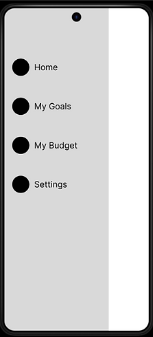
It was important to have all the major tabs all compiled under one panel.
The initial design was made based on feedback and findings from user research.

Usability Study: Findings
Mockups

Before Usability Study
After Usability Study
An updated analytics page featuring monthly expenditure displayed through weekly bar graphs.

Before Usability Study

After Usability Study
Prior to the study, users expressed a desire for alternative sign-in methods, leading to the addition of Google and Facebook login options.

Accessibility Considerations
Color Contrast
High-contrast color schemes were used to ensure text and icons are easily readable for users with visual impairments.
Text Size & Hierarchy
Clear font hierarchy and sufficient text size were applied to support users with low vision or reading difficulties.
Screen Reader Support
Labels and navigation structures were optimized to be compatible with screen readers for users with visual disabilities.
Impact
The redesigned app improved overall usability and made financial insights easier to find. One participant shared, “It finally feels like I’m in control of my money—everything just makes sense now.”
Takeaways
What I Learned
I learned how to plan and conduct usability studies to gather real user feedback and turn it into actionable insights. I also improved my skills in visual design, prototyping, and accessibility. Most importantly, I learned how to iterate based on feedback to create a more user-centered product.
Next Steps
Conduct a third round of usability testing to validate improvements made after the second round and ensure the design changes meet user expectations.
Expand the financial insights section
by adding more personalized data visualizations, since users showed strong interest in deeper control and understanding.
Begin designing a high-fidelity prototype with enhanced accessibility features and animations to prepare for developer handoff and potential real-world testing.